The Birds of a Feather Photography brand has needed a fresh start for some time now. This January we made it a priority to focus on a complete and total rebrand effort, and we needed help. It was time! Time for someone, a professional with a portfolio and experience, to offer advice and artistic guidance on how to bring our brand to life. There was nothing really wrong with our old logo, website and blog, but they didn’t quite make a true brand. There was no real theme or consistency between them. We needed to create a true brand around a central theme, and design it to accurately reflect our style. So we enlisted the help of Katie Durski of Ribbon and Ink to hold our brand by the hand and bring it to where it deserves to be.
Katie is hard at work as we speak, designing everything from our website to our thank you cards, with detail and refinement. Before she could begin the design work, she of course needed a source of inspiration and direction. We talked with her to create a vision for our brand, a mission statement, and the building blocks she would use to complete the artistic designs. There’s much more to a brand than color combinations and font choices, and Katie took us through all that we needed to consider. Over the last month or so, we’ve been doing the work to create a clear understanding of where we want the brand to be, and now we have the pleasure of watching it come to life, piece by piece as Katie turns it all into something beautiful.
Taking it one more step back, before we even met with Katie, the two of us needed to come together and discuss what our personal goal was for this rebrand. We knew Katie would be asking us questions at our initial meeting, and we needed to not only know the answers to her questions, but agree on them as a pair. The two of us needed to really think through what it is we love most about wedding photography, and agree on a path for the business. There is a lot to discuss and think about when refining your brand, and we won’t go into all of them today, but we will share a method the two of us used to gain clear heads before going into meetings with Katie. Our goal was to come to a place where we both fully understood the overarching sense of the brand we wanted to create, while staying true to ourselves. We decided to use the 5 senses as a guide for what our brand would feel like, smell like, sound like, taste like, and look like. Yes, this is a real thing! We’ve heard from so many industry leaders that this is a great exercise in defining your brand, and creating a platform to work from. Here’s what we agreed on…
The 5 Senses of Our Brand
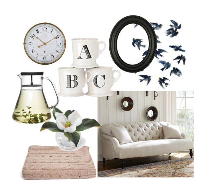
Even more specifically, if our brand were our home, how would we create this space? A home, a place of comfort, a place that holds our memories… how would we use the 5 senses to create a warm, welcoming space designed for sitting back, looking through old photos and connecting with people we love? Here’s how…

Sight
A classic, button tufted sofa in a neutral cream color is a welcoming place to sit and relax. Floor to ceiling windows let in lots dreamy, early evening light. Simple black frames cover the ivory painted walls, and are filled with photographs loved ones. You see a simple, chic, and comfortable space meant for snuggling up with your love, to read a book and watch the sun go down together.
Sound
Birds, of course. The happy song of a house wren calling her babies back to the nest comes through the open window and fills the room. It’s sound is soft, seldom, and perfectly pleasant.
Taste
Wrap your hands around a warm mug, and sip slowly the bright, refreshing, and light taste of herbal mint tea sweetened just a little, with honey.
Smell
A single magnolia blossom, plucked from the giant tree in the backyard, sits next to the window and fills the room with it’s full, sweet, and fresh perfume.
Touch
The room is warm, but the evening air coming through the open window is cooling down as daylight fades. A soft, cozy cable knit blanket is all you need.
And there you have it! The 5 senses of our brand! This is by no means the vision or brand board Katie has created for us (more on that to come!) but it did serve as a launching pad for the two of us to use going into these brand meetings where the real vision was created! This was just phase one of our rebranding process. Follow along with us as it all cones together! In the coming months the new brand will be revealed and we will announce the official launch date!
Comments Off on Rebranding Part One